OC CREATIVE
car.jpg

Sydney Tafe Rebrand

The logo was designed around the idea of taking a part of the exsisting logo, something recognisable,
and turning it into something new, exciting and with meaning, relevance to a whole.
The symbol uses the A (^) out of the exsisting TAFE logo and takes seven of these A’s (^) to form a star
symbol. Each point of the star represents a differerent campus.


Sydney TAFE Rebrand

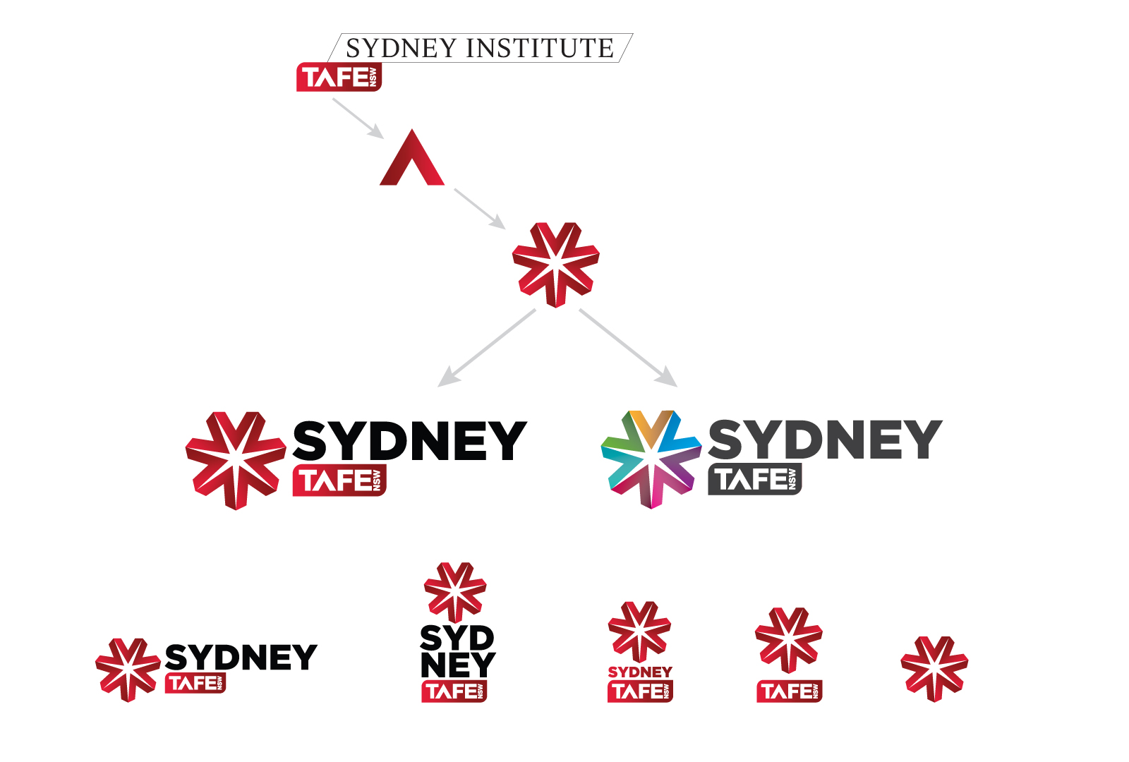
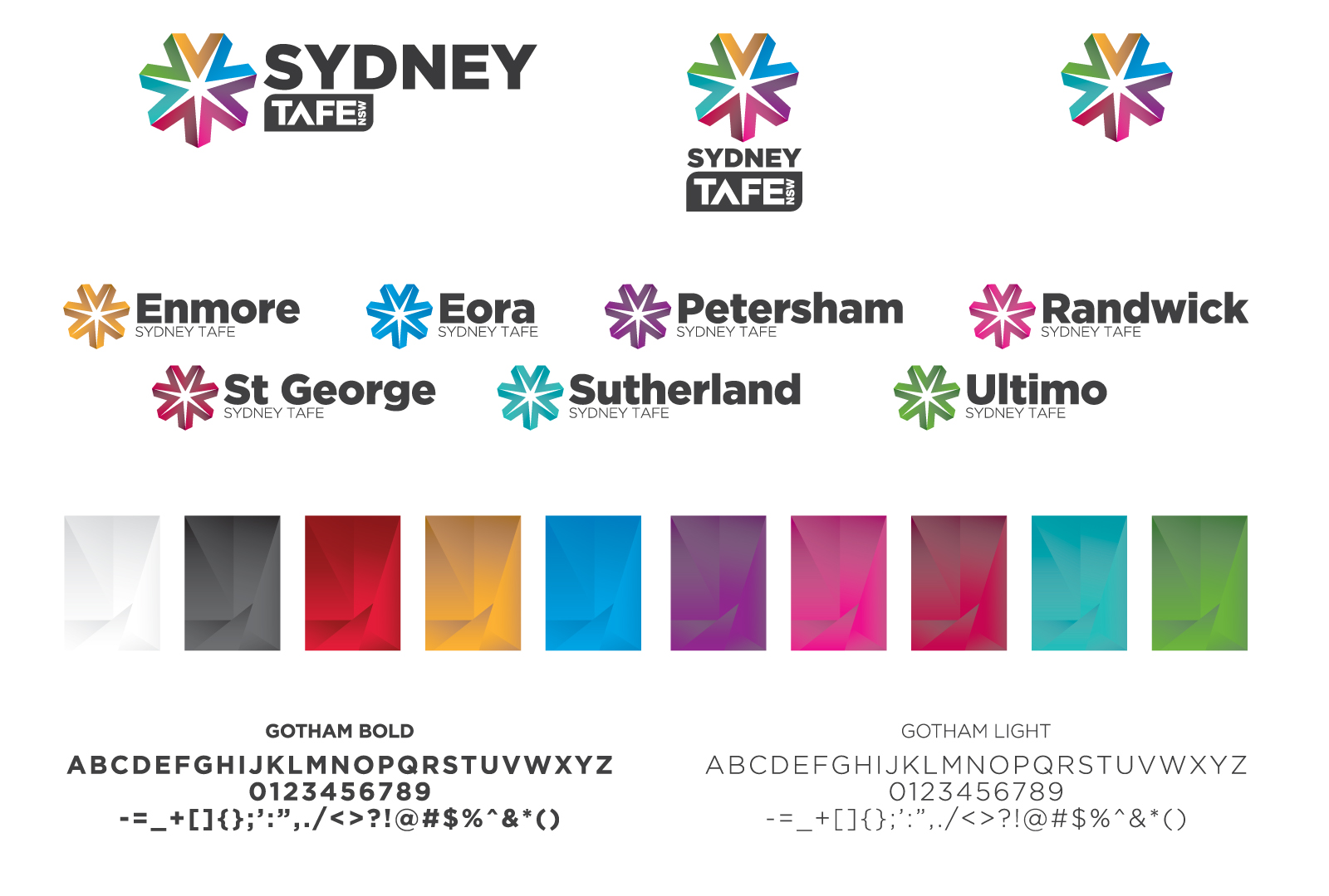
The logo was designed around the idea of taking a part of the existing logo, something recognizable, and turning it into something new, exciting and with meaning, relevance to a whole. The symbol uses the A (^) out of the existing TAFE logo and takes seven of these A’s (^) to form a star symbol. Each point of the star represents a different campus.